- Hints
Hints
Hints represent the visual grammar of the diplomatic layer representation. Any signs which do not belong to the script are hints. Of course, one can draw anything, so the catalog is open and you can freely design your hints. These hints are not meant to be a photographic representation of the sign, like in a facsimile; they rather are more abstract symbols, representing the essential traits of a class of single instances of drawings traced on your document.
Just like phonemes are an abstraction and we describe them only with their relevant traits, dropping those which have no distinctive value and only belong to accidental utterance or non-canonical variants, hints are an abstraction too, and their stylized appearance is used as a class of signs. So, phonemes are related to allophones like hints to the actual drawings in your facsimile.
This way, with a few symbols we can economically represent the signs of a whole corpus, and also implicitly provide their symbolic classification over all texts.
Understanding Hints
Hints are all non-textual signs on the document which hint at a specific operation. For instance, typically when I draw a line on a word, this line sign means that I want to delete that word. So, the line here hints at a deletion operation.
While you can look at the conceptual documentation for more, we can use an analogy from a drawing application for diagrams (Figure 1). In it, you have a catalog of geometrical shapes on the left: to add one, you just pick it and it appears on the drawing surface.
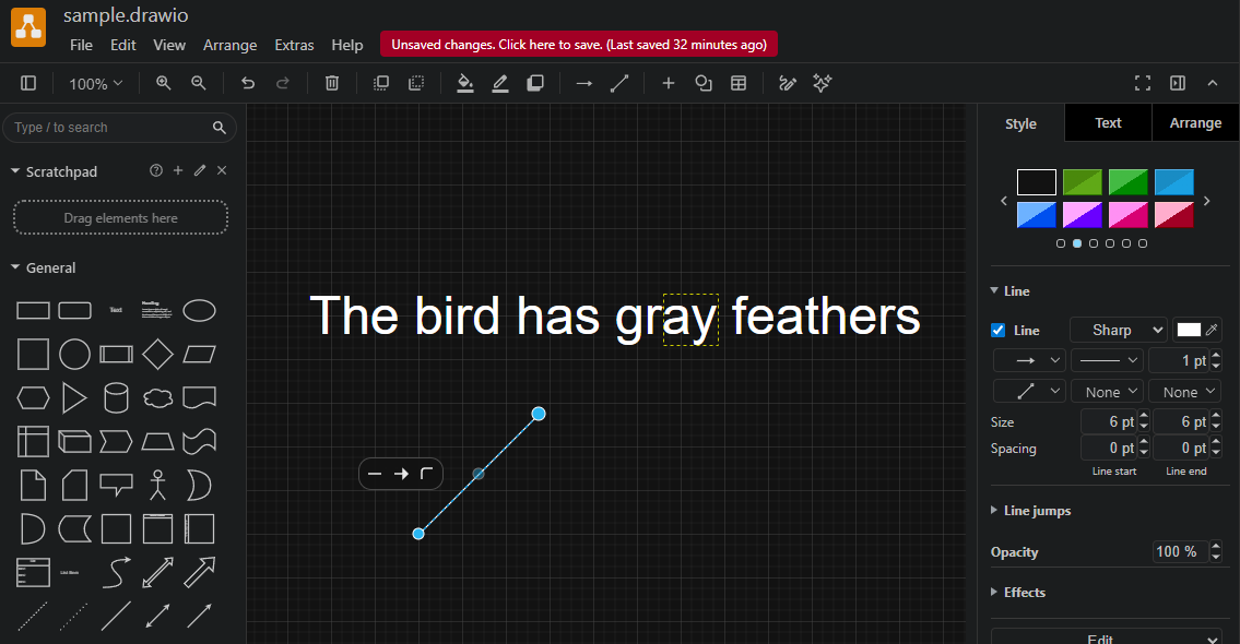
- Figure 1: a drawing application (drawio)
In the figure I have picked a line, which appears in its default size, highlighted in blue with circular handles, used to transform it. You can make the line longer or shorter by dragging its ends, rotate and scale it at will.
Once you have done with transformations, you move it in place. In the drawing example I have put a text: let’s pretend it’s our epigram’s text, where we want to visually represent a replacement. Assume that in our original document we have “gray” with a diagonal line on its last two letters and the letters “een” written above it. This clearly hints to a replacement: “gray” becomes “green”.
As for the text layer, we just care about text: so there we encode the replacement as is: replace “ay” with “een” in “gray”, and the result will be a new alteration of the original text: “The bird has green feathers”.
As for the visuals, we want to encode the line on “ay”. This is the hint to the deletion of the letters which will be replaced by those added above it. To this end, we pick the line from the catalog on the left.
We then resize it to fit the ideal rectangle around the letters being replaced: I have literally drawn it in this figure (dotted yellow rectangle) to make it visible. This is the “reference text bounding rectangle” (RBR) used for sizing and positioning hints in GVE rendition. As we want the line to fully cover these two letters, we start it from the bottom-left corner of this RBR (letter “a”) and end it at its top-right corner (letter “y”: Figure 2).
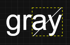
- Figure 2: placing and sizing the line hint in the RBR
So we have 1. picked a hint from the catalog, 2. resized it to fit the RBR and 3. placed it inside the RBR so that the center of the rectangle including the line corresponds to the center of the RBR (this is the meaning of the default position o=origin in GVE). The result is the line right above the two letters, as we wanted.
Of course, we might place the line everywhere else: it could be above the RBR, to its right or left, below it, etc. You just change the position feature for the hint to move it relative to the RBR.
You might also need to slightly adjust the position by shifting the line either horizontally or vertically. To do this, in the drawing application you can just drag it, or select it and repeatedly tap an arrow key. In GVE, you just set the X or Y offset values (including negative numbers: -Y moves to the top, -X moves to the left).
This general mechanism is very efficient because it works automatically whatever the extent of text you select. The hint is just like the line I pick from the catalog in this drawing application: it’s a shape I can transform at will, and then place where I want.
In the renderer, letters “een” which are part of the new text get added automatically, because they are defined within the replacement itself. You just have to specify a position for them, here n=north, i.e. above the RBR.
Finally, let’s change an attribute of that form. Say that in our original document the hand which made this change used a red ink. So we want the line to be red.
In the drawing application, we ensure that our line is still selected, and pick the red color from the right pane, which lists all the attributes of the selected shape (Figure 3).
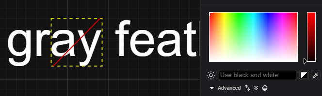
- Figure 3: setting the line’s color to red
The result is a red line instead of the default color. This corresponds to adding features to an operation to further specify hint’s properties. Most hints use placeholders in the SVG code which defines their appearance, which get replaced by values got from other features in the operation. In this case, we can set the foreground text color for the text added (“een”), and this will automatically set also the hint’s color, making the line red.
So, when you add hints you can think in similar terms: once you have encoded the textual operation, add its visual signs using hints:
- pick the hint from the catalog.
- optionally set its relative position.
- optionally resize, rotate or offset it.
- add features for that hint, if required, like color.
This is like using a drawing application, but instead of manually doing every step, you just give the renderer text-based directions, like “pick the diagonal-stroke-up hint”, “set its color to red”: all the rest is taken care by the rendering software.
Additionally, most hints already have their properties (including position) preset in the best way for their intended use. In most cases you will at most need to slightly shift their position using offsets, but you are always free to change all its properties at will. In our analogy, we can compare this with the different preset types of lines you find in the drawing application, e.g. dotted vs. solid line. You can directly pick the dotted line as a shortcut, but you can also pick the line and later change it to dotted.
Designing Hints
To design a hint, you typically use a combination of tools:
- any SVG editor like InkScape to literally draw it.
- the hints designer. This links points to a demo page you can directly use. Otherwise, just add the designer component (which is a standard W3C custom web component) into your HTML page and run it locally or elsewhere.
For consistency, all the hints belonging to a project are designed in a fixed-size drawing area, which defaults to 300x100 pixels. This ratio is consistent with the main purpose of hints, which are typically placed on top of the text they annotate; and in most cases, text is longer than taller. As hints are typically resized when drawn, this is just a ratio and the real size does not matter.
💡 Unless you have reasons to do so, it is strongly suggested to keep using this fixed size, so that you can reuse hints from our projects without having to rescale them.
To draw a hint using InkScape:
-
create a new document and size it accordingly (
File/Document Properties): by default 300x100, units px everywhere, scale 1 (Figure 4).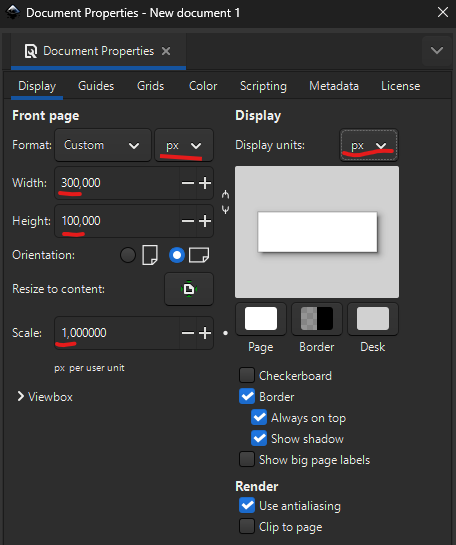
- Figure 4: setting InkScape document properties
You can open this SVG file in InkScape to start with:
<?xml version="1.0" encoding="UTF-8" standalone="no"?>
<svg
   width="300"
   height="100"
   viewBox="0 0 300 100"
   version="1.1"
   xmlns="http://www.w3.org/2000/svg"
   xmlns:svg="http://www.w3.org/2000/svg">
  <g>
    TODO: paste here your SVG
  </g>
</svg>
- freely draw your hint. Consider that your area represents the bounding box around the text selected by an operation. So for instance if you are going to draw a horizontal stroke all over it, draw a horizontal line from edge to edge, vertically centered. If you want this line to be slightly longer than the text, you will apply an X-scale to it later in the hints designer.
- save the document and open it in a code or text editor. Copy the SVG elements found in the document, and ensure they are all wrapped in a single
gelement which will become the root element of the SVG snippet used by hints. - in the hints designer, create a new hint and paste the SVG code you copied in its SVG box. Then adjust all the other properties as you desire and pick an entrance animation for it.
- if required, replace literal values from your SVG with placeholders. For instance, typically the color is designed to be a placeholder depending from the
r_fore-colorfeature. Remember that for every placeholder you use you must define a value for it in the designer (Hint Variablespane), so that the hint can be drawn. - when done, save all hints into a JSON file by clicking the “Save data to file” button in the top toolbar. Then, copy it and paste it in your API
seed-profile.jsonundersettings/it.vedph.gve.snapshot/hintsproperty. Remember to update thesnapshot-feat-valuesthesaurus accordingly, as this contains the list of all hints users can pick from in the editor.
💡 If you want to edit an existing hint in InkScape, select it and click the “Export hint to InkScape SVG” button. This will embed the hint’s SVG into a standard InkScape code frame ready to be loaded in that editor, also replacing all placeholders with values to avoid load errors.
Design Canvas
Note that every hint is drawn on a virtual design canvas whose size is fixed (set in settings, default=300×100). The renderer scales the hint’s <g> root element so that this canvas maps exactly onto the reference text bounds (the RBR), then centers it according to the position property and shifts it by any offset. The scale factors are computed by dividing the RBR dimensions by the <g> element’s own bounding box (getBBox()).
Note that getBBox() reports the tight geometric box around the actual drawn content, not the 300×100 canvas. If the visible elements do not touch both edges of the canvas in a given axis, the bounding box in that axis is smaller than the intended 300×100, and the computed may be not what you expect. The worst case is a single horizontal line, which has height=0: the renderer cannot compute scaleY, falls back to 1, and the line ends up at the vertical center of the text regardless of where it sits in the design canvas. For example a line drawn at y=100 (bottom of the canvas) renders as a strikethrough instead of an underline.
So when you want the SVG canvas coordinates to be meaningful, always add a sentinel rectangle as the first child of the root <g>:
<g>
  <rect x="0" y="0" width="300" height="100" fill="none" stroke="none"/>
  <!-- your actual design content here -->
</g>
This guarantees getBBox() always returns {x:0, y:0, width:300, height:100}, so both scale factors are computed correctly and the hint appears exactly where the canvas positions it.
Instead, omit the sentinel when the content is meant to self-fit the RBR; in this case you will use position and offset as the sole controls for placement.
Hints whose visible content already spans the full canvas — two diagonal lines from corner to corner, a border rectangle, three horizontal lines top/middle/bottom — do not need the sentinel.
Note: the sentinel rect has
fill="none" stroke="none", so it is completely invisible and does not interact with pointer events. Its sole purpose is to anchor the bounding box. Wipe animations that selectrectelements viaquerySelectorAllwill include it, but since it has no stroke, DrawSVGPlugin has nothing to animate on it and simply skips it.
Hints Designer
The hints designer is a W3C custom web component you can use as a tool to help you design hints. In the end, hints are defined in JSON code, so it’s easy to get JSON from the component and paste it in place (typically, in the backend settings of your editing environment).
The designer UI (Figure 5) has a top toolbar where you can find the list of all the hints in your catalog. By default, in the demo you will find hints from VEdition’s catalog.
Each hint has a name and can be selected from the dropdown. Its visual appearance is displayed below the toolbar. In Figure 5 you see the diagonal stroke up hint, which is simply a diagonal line raising from the bottom-left corner to the top-right corner of the design grid.
The size of the design grid is a parameter of the designer. By default it is 300x100.
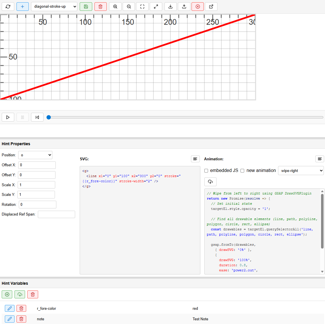
- Figure 5: the hints designer
The hint designer UI has these main panels (from top to bottom):
- toolbar: the main toolbar with all the most important controls for editing hints.
- SVG visualization: the visualization of the SVG hint you are editing. You can zoom using the buttons in the toolbar, or the mouse wheel. You can pan by dragging with the mouse.
- animation timeline player: use the play button to play the enter animation for the SVG being edited. You can use the slider next to it to look at the animation as it unwinds towards its end, going forward or backward and pausing at any point along it.
- hint properties: the metadata of the hint, plus its SVG and JS code. This is where you effectively edit the hint.
- hint variables: the variables you define for previewing hints. Many hints in their SVG code use placeholder variables between ``, like in
<line x1="0" y1="0" x2="300" y2="100" stroke="" stroke-width="2" />; in this case, you can define ther_fore-colorvariable value in this panel. Typically you define here all the variables for all of your hints. This data is volatile, and is used only to allow displaying the hints in the SVG visualization. For instance, we will require to setr_fore-colortoredto see the hint drawn.
In general:
- keep it simple: create a basic hint first, using placeholders wherever this could be useful to make it more reusable (e.g. for changing its color), and pick an animation for each. As for its appearance, the hint is a symbolic visual approximation, mostly designed for reuse, and typically displayed at small size; so keep it simple and readable. Also remember that hints will be stretched to fit the RBR, so draw and configure them accordingly.
- use the catalog: create reusable animations for common effects (fade, slide, etc.).
- test early: use the timeline player frequently while developing animations.
- save often: use the Save data button to backup your work regularly.
Editing Hint Properties
In the hint properties, you edit all the properties of the hint being edited:
- position: the relative position of the hint (default is
o=origin). - offset X and offset Y: the optional offsets (positive or negative) to shift the hint’s position accordingly. Default is 0.
- scale X and scale Y: the optional scale ratio for resizing the hint. Default is 1 (=no scaling).
- rotation: the optional rotation in degrees (positive or negative) for the hint. Default is 0 (=no rotation).
- displaced ref span: a default reference span for displacing hints. This is rarely used, unless you want to always position a hint e.g. with reference with the initial character(s) of your base text.
- SVG: the SVG code for your hint. This can be any SVG, provided that it is always included in a single, root
gelement. For instance:
<g>
  <line x1="0" y1="0" x2="300" y2="100" stroke="" stroke-width="2" />
</g>
This hint’s SVG code wraps in a g element (required) a single line in a designer whose canvas size is 300x100 (this is set via the web component’s settings in the host page). Thus it represents a diagonal line from the top left to the bottom right of the canvas rectangle.
Hint content can also have handle elements and placeholders (see rendition for more).
- animation: the animation panel contains the JS code fragment for the enter animation for the hint. Unless you are creating an ad-hoc animation for the hint being edited (“embedded JS”), this is usually drawn from a set of available animations.
The JS code follows this template, where you can assume two variables are defined: targetEl is the target element of the animation, i.e. the root g element of the hint; gsap is the GSAP object used for animating it:
return new Promise(resolve => {
  // targetEl is the animation's target element
  // gsap is the GSAP object
});
For instance, this is a simple fade-in animation:
return new Promise(resolve => {
  gsap.fromTo(targetEl,
    { opacity: 0 },
    { opacity: 1, duration: 2, onComplete: resolve }
  );
});
This code wraps the animation in a
Promiseobject which is returned to the consumer code. This is required by the rendition engine architecture. Inside the promise, it usesgsapto animate the target element’s opacity from 0 (=invisible) to 1 (=fully visible) in 2 seconds. Remember to call resolve on complete by addingonComplete: resolve.
📖 For GSAP, see:
- GSAP Documentation.
- DrawSVG Plugin: plugin for animating SVG.
👉 The animations UI is designed so that it reflects the fact that animations depend on hints, i.e. are selected by them. Besides, you can’t design and test an animation without having a hint to apply it to. So, this is the logic when you save an animation:
- if
embedded JSis checked, the JS code is saved as the embedded JS for that hint only. - otherwise:
- if the hint’s animation control value does not start with
#the animation’s code is saved into the data’sanimationsarray with an ID equal to the selected animation in the animations list dropdown (when the “new animation” is off). Ifnew animationis on, you will be prompted for a new ID for that animation’s code. - else, just save the animation control value into the hint’s animation property as a reference (
#followed by hint). Just ensure that#is followed by some identifier, else show an error in the messages pane asking to add an identifier after the#.
- if the hint’s animation control value does not start with
So, in practice:
- 💡 to create a new catalog animation:
- select or create a hint.
- uncheck “embedded JS”.
- check “new animation”.
- write your GSAP animation code in the JS textarea.
- click Save.
- when prompted, enter an ID for the new animation (e.g.,
fade-in).
- 💡 to update a catalog animation:
- select or create a hint.
- uncheck “embedded JS”.
- uncheck “new animation”.
- select an animation from the dropdown.
- click the Load animation code button (⬇) to load its code.
- modify the animation code in the JS textarea.
- click Save and confirm.
⚠️ Warning: updating a catalog animation affects all hints using it!
- 💡 to use a catalog animation in a hint:
- select or create a hint.
- uncheck “embedded JS”.
- in the JS textarea, type
#followed by the animation ID (e.g.#fade-in). - click Save.
- 💡 to copy animation code between animations:
- select an animation from the dropdown.
- click the load animation code button (⬇).
- the code appears in the JS textarea.
- modify it as needed.
- either:
- check “new animation” and save with a new ID, OR
- select a different animation from the dropdown and save to update it.
💡 Tip: the dropdown works even when “embedded JS” is checked, so you can copy animation code to use as embedded JS.
Using Placeholders in SVG
Placeholders allow you to reuse hints with different values, derived from operation features with the same name, or set via the r_hint-vars rendition feature.
-
In your SVG code, use `` syntax:
<g> <rect fill="" x="0" y="0" width="100" height="50"/> <text x="50" y="25"></text> </g> - in the Hint Variables panel:
- click Add (➕).
- enter the variable name (e.g.,
r_fore-color). - click Edit (✏️) to set its value (e.g.,
red).
- click Refresh to see the resolved SVG.
Saving Hints Locally
At any time, whether you are integrating the designer into a more complex UI and workflow or just using it directly, you can save or load your data using local files.
To save:
- click the Save data button (📥) in the toolbar.
- a JSON file (
hint-designer-data.json) will download. This file contains all hints and animations.
To load:
- click the Load data button (📤) in the toolbar.
- select your JSON file. All hints and animations will be loaded.
The component saves/loads data in JSON format, e.g.:
{
  "hints": {
    "hint-id": {
      "svg": "<g>...</g>",
      "position": "o",
      "offsetX": 0,
      "offsetY": 0,
      "scaleX": 1,
      "scaleY": 1,
      "rotation": 0,
      "animation": "#animation-id"
    }
  },
  "animations": {
    "animation-id": "return new Promise(resolve => { ... });"
  }
}
Catalog
This is the catalog of hints for our project. Wherever hint properties are not specified, it is assumed their default value, as follows:
- position=
o(origin) - X-offset: 0
- Y-offset: 0
- X-scale: 1
- Y-scale: 1
- rotation: 0
In the following list the following icons are used:
- 🎯 hint’s main purpose
- ⏯️ entrance animation for hint
- 🔴 placeholder variable in hint, must be specified by adding the corresponding feature
- ☑️ hint’s property predefined in its design (only when different from default)
Lines
diagonal-stroke-down

- 🎯 deletion hint
- ⏯️ wipe-right
- 🔴
r_fore-color: line color
Designed to be drawn above text.
diagonal-stroke-up

- 🎯 deletion hint
- ⏯️ wipe-right
- 🔴
r_fore-color: line color
Designed to be drawn above text.
cross-stroke

- 🎯 deletion hint
- ⏯️ wipe-right
- 🔴
r_fore-color: line color
Designed to be drawn above text.
horizontal-stroke

- 🎯 deletion hint
- ⏯️ wipe-right
- 🔴
r_fore-color: line color
Designed to be drawn above text.
vertical-stroke

- 🎯 deletion hint
- ⏯️ wipe-down
- 🔴
r_fore-color: line color
Designed to be drawn above text.
hamburger

- 🎯 finer-grained deletion hint
- ⏯️ wipe-right
- 🔴
r_fore-color: line color
Designed to be drawn above small portions of text, usually a single character, as a lighter deletion hint, often meant to delete just some traits of a letter.
hotdog

- 🎯 finer-grained deletion hint
- ⏯️ wipe-right
- 🔴
r_fore-color: line color
Designed to be drawn above small portions of text, usually a single character, as a lighter deletion hint, often meant to delete just some traits of a letter.
pie

- 🎯 selection hint
- ⏯️ wipe-right
- 🔴
r_fore-color: line color - ☑️ offset-Y: 20
slash-double

- 🎯 deletion hint
- ⏯️ wipe-right
- 🔴
r_fore-color: line color
backslash-double

- 🎯 deletion hint
- ⏯️ wipe-right
- 🔴
r_fore-color: line color
scribble-wavy

- 🎯 deletion hint
- ⏯️ wipe-right
- 🔴
r_fore-color: line color - ☑️ X-scale: 1.1
- ☑️ Y-scale: 1.1
Borders
box

- 🎯 text selection hint
- ⏯️ wipe-right
- 🔴
r_fore-color: line color - ☑️ X-scale: 1.1
- ☑️ Y-scale: 1.1
Designed to hint at a selection of text to be logically connected to some operation or other part of the text, or to isolate the text from its context and make it stand out (e.g. an epigram number). The 110% scale is used to avoid having the box “stitched” too tight around the text.
filled-box

- 🎯 text selection hint
- ⏯️ wipe-right
- 🔴
color: color (this is not the name of a rendition feature, so set it directly viar_hint-vars) - ☑️ X-scale: 1.1
- ☑️ Y-scale: 1.1
Designed to “highlight” a text using the specified color at a 30% opacity level. The 110% scale is used to avoid having the box “stitched” too tight around the text.
bowl

- 🎯 text selection hint
- ⏯️ wipe-right
- 🔴
r_fore-color: line color - ☑️ X-scale: 1.1
- ☑️ Y-scale: 1.1
line-bottom

- 🎯 text underline hint
- ⏯️ wipe-right
- 🔴
r_fore-color: line color
Designed to underline some text (not at the same time of writing).
line-bottom-dotted

- 🎯 text restoration hint
- ⏯️ wipe-right
- 🔴
r_fore-color: line color
This variation of line-bottom is mostly used to restore a text which was previously deleted.
line-top

- 🎯 text overline hint
- ⏯️ wipe-right
- 🔴
r_fore-color: line color
Overline some text (not at the same time of writing).
line-top-dotted

- 🎯 text overline hint
- ⏯️ wipe-right
- 🔴
r_fore-color: line color
This is a variation of line-top, provided for consistency, yet not seemingly used in our corpus.
line-left

- 🎯 text segmentation hint
- ⏯️ wipe-down
- 🔴
r_fore-color: line color
This is mostly used to segment text according to some criterion, typically metrical.
line-right

- 🎯 text segmentation hint
- ⏯️ wipe-down
- 🔴
r_fore-color: line color
This is mostly used to segment text according to some criterion, typically metrical.
Letters
bracket-left

- 🎯 text segmentation hint
- ⏯️ wipe-down
- 🔴
r_fore-color: line color
bracket-right

- 🎯 text segmentation hint
- ⏯️ wipe-down
- 🔴
r_fore-color: line color
dotless-exclamation

- 🎯 compendiary correction
- ⏯️ wipe-down
- 🔴
r_fore-color: line color
Change a dot into an exclamation mark by adding the vertical trait above it.
i-dot

- 🎯 compendiary correction
- ⏯️ fade-in
- 🔴
r_fore-color: line color - ☑️ Y-offset: -16
- ☑️ Y-scale: 0.3
Add a dot on a dotless i.
umlaut

- 🎯 compendiary correction
- ⏯️ fade-in
- 🔴
r_fore-color: line color - ☑️ Y-offset: -16
- ☑️ Y-scale: 0.3
Add a missing umlaut on a letter.
Connectors
half-psi

- 🎯 insertion anchor
- ⏯️ wipe-down
- 🔴
r_fore-color: line color - ☑️ Y-scale: 1.5
Typically used to show the insertion point inside the text, adding inserted text somewhere above it. The 150% vertical scale is used to make it extend above and below the text. The hint’s name derives from its resemblance to the right half of a Greek ψ (psi) letter.
snake

- 🎯 insertion anchor
- ⏯️ wipe-right
- 🔴
r_fore-color: line color - ☑️ X-scale: 120%
- ☑️ Y-scale: 200%
Typically used to show the insertion (or replacement) point inside the text, adding inserted text somewhere above it.
snake-left

- 🎯 insertion anchor
- ⏯️ wipe-right
- 🔴
r_fore-color: line color - ☑️ Y-scale: 200%
Typically used to show the insertion (or replacement) point inside the text, adding inserted text somewhere above it.
snake-right

- 🎯 insertion anchor
- ⏯️ wipe-right
- 🔴
r_fore-color: line color - ☑️ Y-scale: 200%
This is the left counterpart of snake-left provided for consistency, yet not seemingly used in our corpus.
Callouts
Callouts are used to link an annotation text to its annotated text. They are not used to represent text, but only annotations. Added text (by add or replace operations) is just the value of the corresponding operation and being part of the text has a relative placement, though it might be flanked by additional hints, like lines.
snake-callout

- 🎯 textual annotation
- ⏯️ wipe-right
- 🔴
r_fore-color: line color - 🔴
note: text in callout
A textual annotation not belonging to the text, placed above a snake-like callout.
Text
note-above

- 🎯 textual annotation
- ⏯️ wipe-right
- 🔴
r_fore-color: line color - 🔴
note: text in callout - ☑️ position:
n - ☑️ Y-offset: -10
A textual annotation not belonging to the text, placed above it without any further sign.
note-interlinear-above

- 🎯 textual annotation
- ⏯️ wipe-right
- 🔴
r_fore-color: line color - 🔴
note: text in callout - ☑️ position:
n - ☑️ Y-offset: 4
A smaller (font size=14) textual annotation not belonging to the text, placed above it (as an interlinear note) without any further sign.
Symbols
checkmark

- 🎯 group identifier
- ⏯️ wipe-right
- 🔴
r_fore-color: line color - ☑️ X-scale: 2
- ☑️ Y-scale: 2
circle-dotted

- 🎯 group identifier
- ⏯️ wipe-right
- 🔴
r_fore-color: line color - ☑️ X-scale: 1.5
- ☑️ Y-scale: 1.5
nota-bene

- 🎯 attention symbol
- ⏯️ wipe-right
- 🔴
r_fore-color: line color - ☑️ X-scale: 2
- ☑️ Y-scale: 2